· 3 min read · Triple Helix
The Psychology of Clicks: Why Users Do (or Don’t) Engage With Your Website
Every website click tells a story — a small but powerful moment of decision-making that reveals how people think, feel, and react to digital environments. Whether users explore deeper into your…
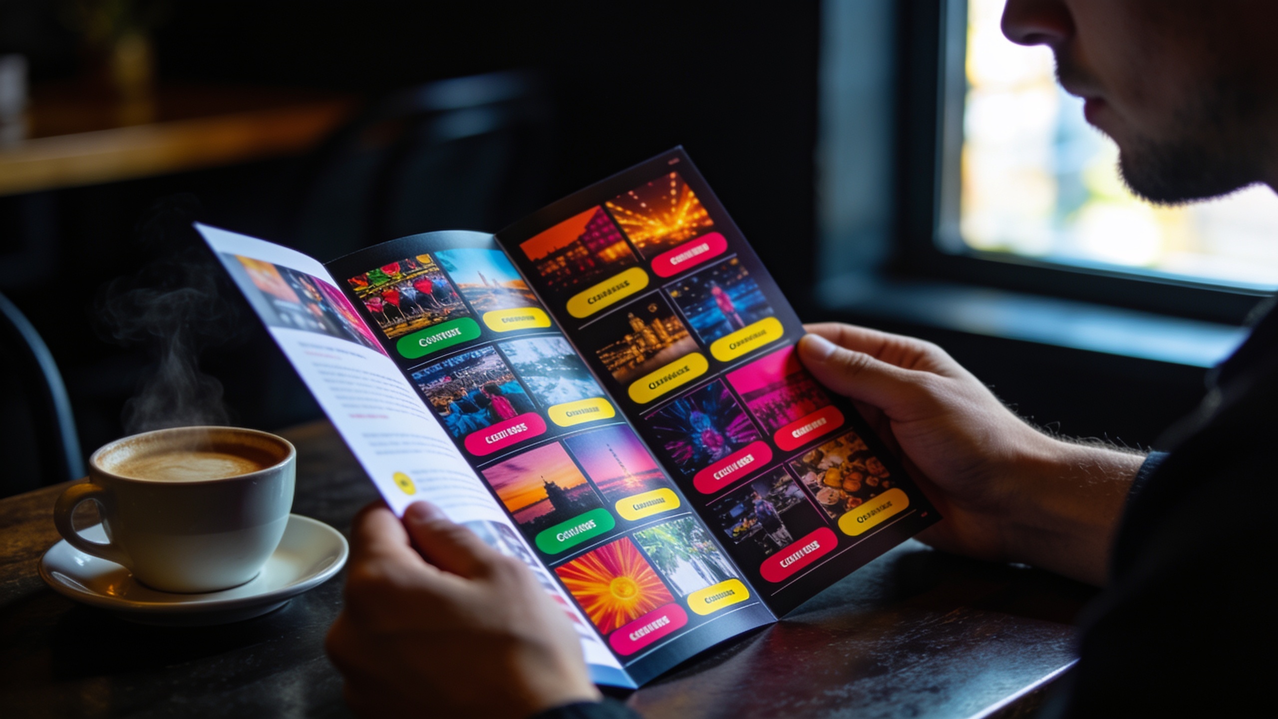
The Invisible Science Behind Every Click
Every website click tells a story — a small but powerful moment of decision-making that reveals how people think, feel, and react to digital environments. Whether users explore deeper into your content, abandon a form halfway through, or bounce within seconds, each action stems from psychology. The colors you use, where you place a button, and even how your words sound all influence how the brain decides what to do next.
For many businesses, the difference between a site that converts and one that doesn’t isn’t a matter of luck or product quality. It’s rooted in how well your site aligns with human cognitive patterns. A visitor’s behavior is rarely random — it’s a reflection of how intuitive, emotionally resonant, and psychologically aligned your digital design is.
Color Theory and Emotional Triggers
Color is one of the first things users perceive, and it often sets the emotional tone for their entire experience. Blue conveys trust, which is why it dominates financial institutions and technology companies. Red stimulates urgency and excitement — a reason “Buy Now” buttons often use it to inspire action. Green, associated with balance and renewal, puts users at ease and works beautifully for service-oriented or eco-conscious brands.
However, effective color use isn’t just about aesthetics; it’s about balance and intent. Too much stimulation can cause cognitive overload, while too little can make your site feel sterile or uninspiring. The most effective designs use color to guide users — subtly drawing the eye toward key elements without overwhelming them.
The Hidden Power of Button Placement
Humans are creatures of habit. Over time, we’ve learned certain visual patterns — like expecting the logo to be in the top left, navigation at the top, and calls to action centered or bottom-right. When these expectations are broken without purpose, users hesitate. That hesitation, however brief, often leads to lost conversions.
Effective button placement is about predicting where the user’s attention will land next. Eye-tracking studies show that users follow an “F-pattern” or “Z-pattern” when scanning pages, meaning calls to action should appear where the eye naturally ends its journey. Subtle contrast, whitespace, and repetition reinforce these focal points, making it effortless to find — and click — the right action.
Cognitive Biases and Click Behavior
We like to think our decisions are logical, but most are driven by subconscious biases. The “anchoring effect” makes users base judgments on the first option they see — so pricing tables that position premium options first can subtly influence what feels like a “reasonable” choice. The “loss aversion” principle means people are more motivated to avoid missing out than to gain something new — a reason “limited time” or “only 3 left” cues can work powerfully when used ethically.
Understanding these biases helps design websites that align with natural human tendencies rather than fight them. When design supports how people want to decide, engagement rises effortlessly.
Designing for Intuitive Interaction
A truly effective website feels effortless. Every scroll, click, and form fill flows naturally. Users don’t have to think about what to do next — they just do it. This intuitive experience comes from deep alignment between design psychology and user behavior.
That’s where data-driven redesign comes in. Analytics and heatmaps reveal how users actually interact with your site — what draws them in, where they hesitate, and when they leave. With those insights, small psychological design tweaks can yield major performance gains.
Clicks aren’t random. They’re reflections of trust, curiosity, and mental ease. By combining behavioral science with data and thoughtful design, you can transform your website into a conversion powerhouse that feels seamless and human.
Ready to understand what drives your users to click — and why they sometimes don’t? Partner with Triple Helix Corporation for a data-driven UX and web redesign consultation that blends psychology with performance. Let’s turn insights into engagement.
Ready to Transform Your Business?
Let's discuss how our data solutions and technology expertise can help your organization achieve its goals.
Get In Touch